Short-Term Loan
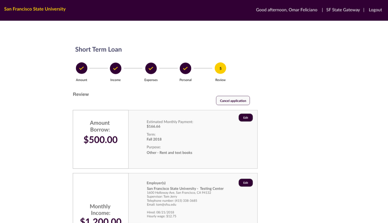
Short Term Loan Program assists San Francisco State students with school-related expenses when they have an emergency financial situation.
My Role
- Lead UX
- UX Design
- UI Design
Team
- One designer
- Three developers
- One product owner
Tools
- Adobe XD
- Adobe Photoshop
Convoluted loan process
The current Short Term Loan Program application convoluted process - part web...part paper-based application. The user interface relied heavily on user recall and little in reducing stress on students.
The goal: Design a simple and transparent process for applying for a loan.
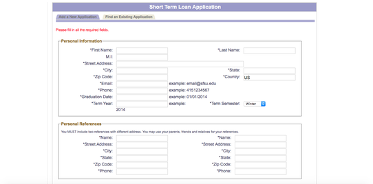
Data entry for details already known to the university increased frustration with the process.
Approach
We worked closely with the Fiscal Affairs team to understand both the compliance and their initiative to offer as much transparency to the students.
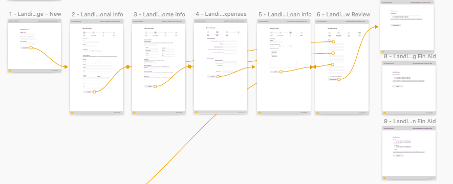
We deployed collaborative research, iterating through designs, and working prototypes. We conducted five usability sessions with students ranging from first-semester to graduating seniors to ensure the updated user flow reduced pain points for users.
Impact
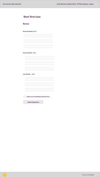
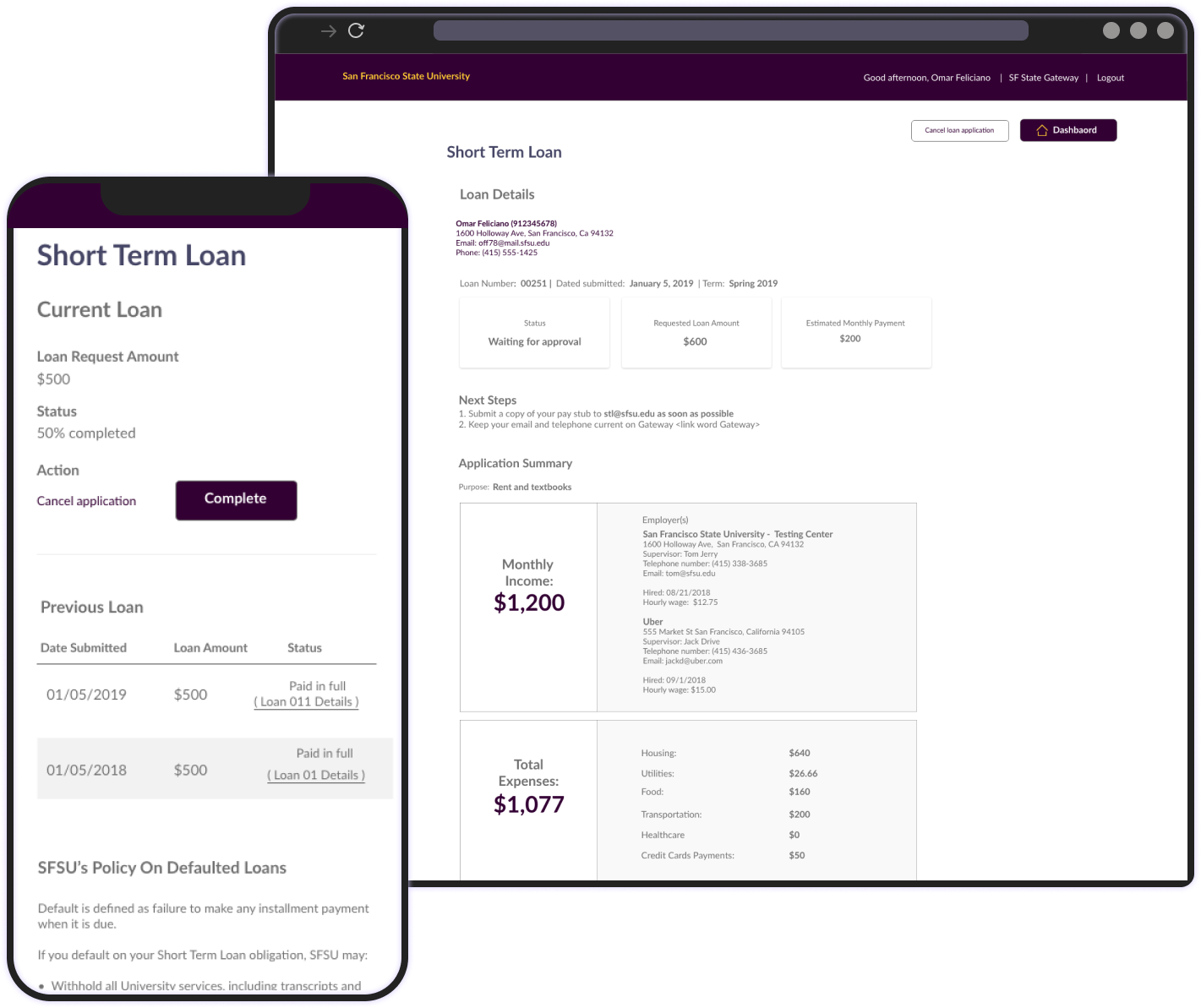
We reduced the processing time from five days to two days by reducing data entry during the application period. Additionally, the revamped process reduces the cognitive load for users and introduces accessible process signifiers. Further, the new application keeps students apprised of each stage of the process.
The streamlined process allowed Fiscal Affairs to reduce follow up time by 50% during the application review. Thus they have tripled the number of applications reviewed in a single day.
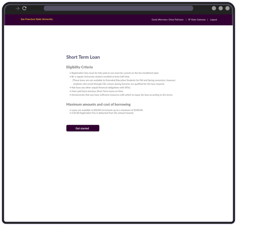
Upfront details on loan eligibility and requirements
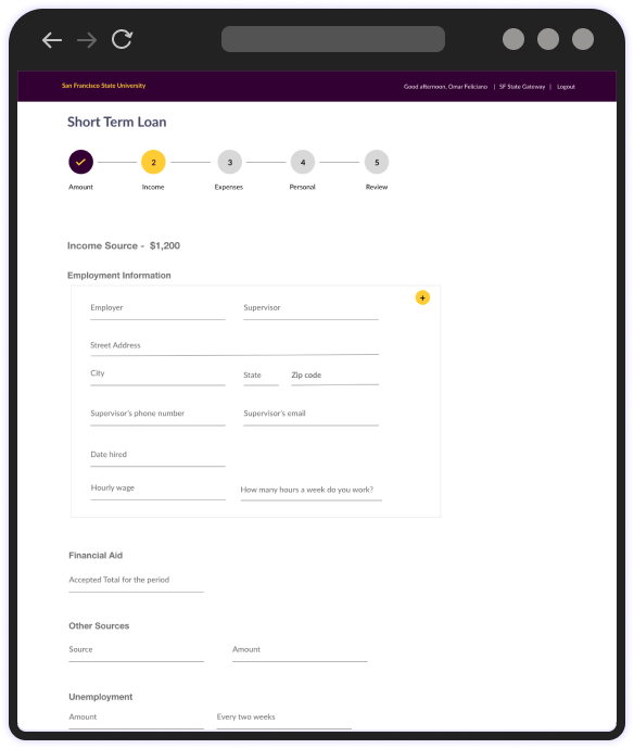
Reduce data entry during onboarding by only asking for details unknown to the university.
See next...
