SF State Mobile App
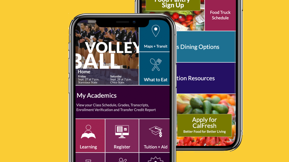
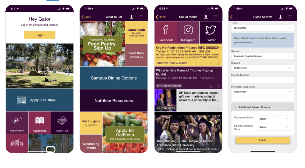
SF State Mobile app is the official mobile platform at San Francisco State University.
We created SF State Mobile to make it easier for you to get access to campus services and resources on the go. Since the app is a work constantly in progress, we’ll continue to improve and enhance your mobile experience.
My Role
- Lead UX
- UX Design
- UX Research
Team
- One designers
- Two developers
- One product owner
Tools
- Adobe XD
- Adobe Photoshop
Challenge
Design an app greatly rooted in utility while provides engaging features. Furthermore, the app should provide a welcoming first-year experience.
Approach
Our focus was on utility. We conducted contextual interviews on how students and faculty used the campus tools.
Together with persona development, we narrowed the features to core functions students, staff, and faculty needed to complete their tasks.


Impact
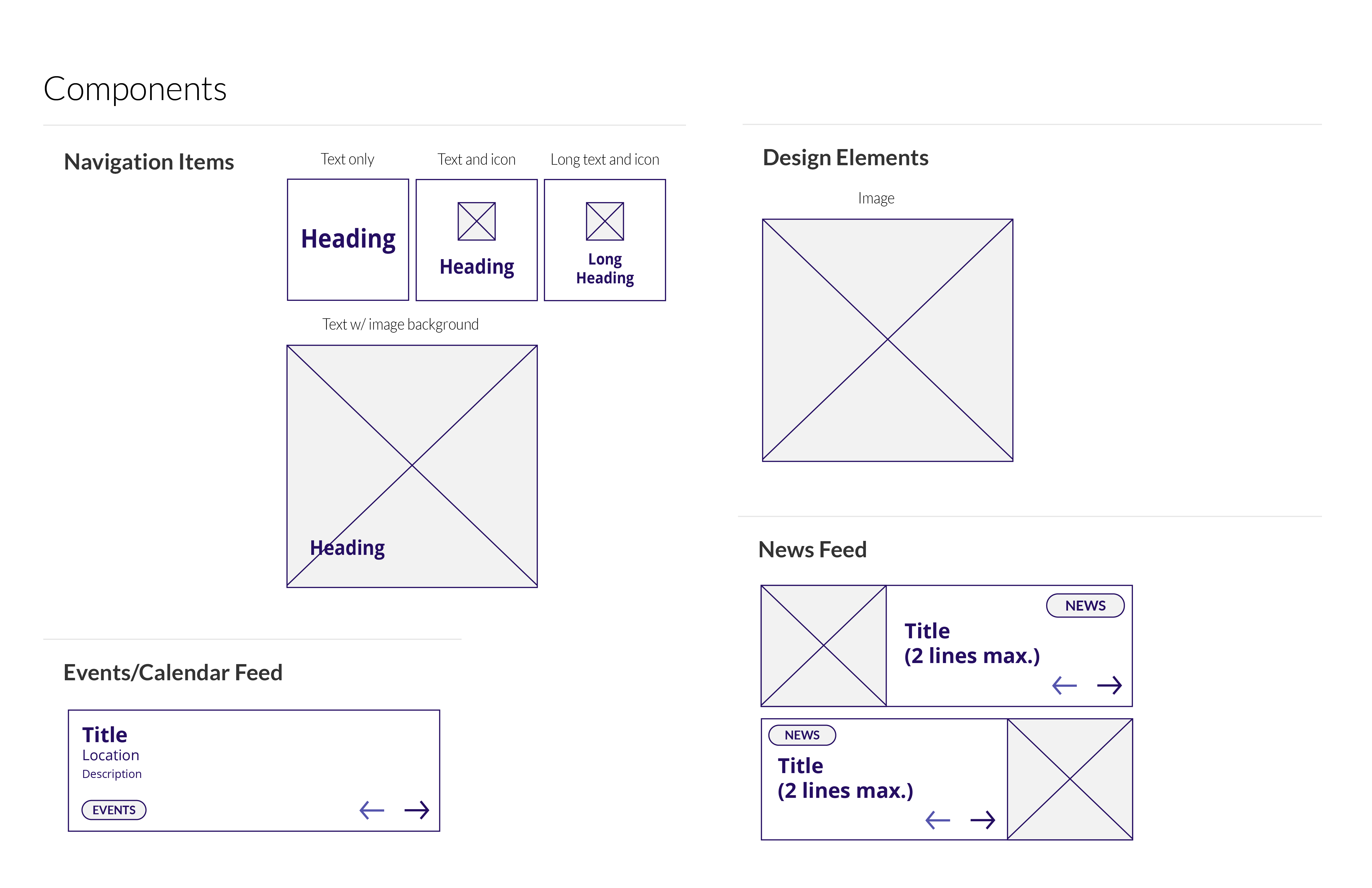
We created a single, simple interface for students, staff and faculty to quickly access core functions. Upon our redesign of the university mobile app, increase student registration via the app by 48%.
Furthermore, the usability sessions concluded most participants found the app to be well-organized, uncluttered and easy to use. However, the participants stated the app skews to students living on campus and new students.


See next...
